Microsoft Word is the most popular word processor, and the .docx format is the standard for text documents. It’s also often used to create PDF and HTML files for websites. There are many ways to make your Word documents easier to use for people with disabilities, and this feature gets better with each new version of Office.
Making Word Files Accessible:
By following these tips, you can help more people access your document online.
-
Styles
The Importance of Styles in Accessible Documents
Styles are very important for making documents easy to read and use. They control how the text looks, such as the type of letters used, how paragraphs are set up, and the space between lines. When you use a certain style, all the text with that style will look the same.
But styles do more than just make things look nice. They help show the different parts of the document, like headings and lists. This is helpful for people who use technology to read documents, as it helps them understand and move through the document easily.
Note:
-
Use simple wording for content (8th grade reading level).
-
Make sure the font size is big enough, at least 11 points.
-
Ensure text colors stand out from the background.
-
Don’t use color as the only way to share information.
-
Be careful with watermarks, as they can make text hard to read.
Modifying Styles
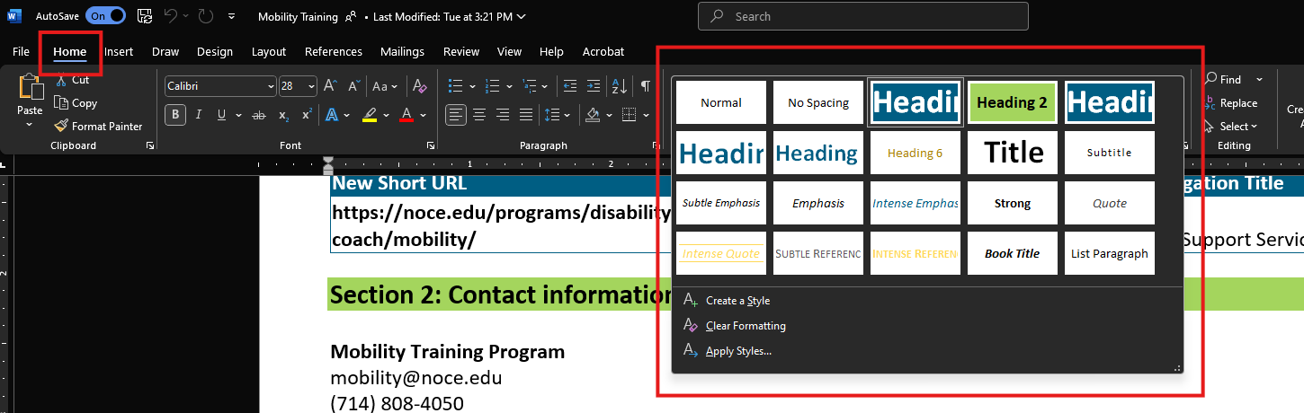
Word gives you lots of preset styles to pick from. To use a default style on your document, click on the text line you want to change. Go to the Home tab and find Styles.
-
You can select one of the styles shown or click the arrow button in the lower right corner of Styles to see more options.
-
Choose the style you like and apply it to the text.
If the preset styles aren’t what you want, you can change any style to fit your needs. Just make sure not to change the style name. We suggest staff and faculty use our NOCE-branded templates, and any changes should follow branding rules.
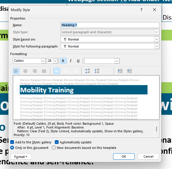 To change a style, find it in the Styles gallery or dialog box, then right-click it. Choose Modify to open the Modify Style window.
Here, you can change basic font settings like font type and size. Lato is the NOCE brand font, so we recommend using it. Or, pick a simple font like Arial for easy reading.
If you want to make more changes, click the Format button at the bottom left of the window. You can adjust settings like paragraph spacing. After making changes, click OK to save them.
-
-
Headings
Headings are one of the most important styles in Word. They’re easy to spot because they are large and bold. However, people who can’t see the document miss these visual clues. By using heading styles, people who use assistive technology get notified about headings, which helps them move around the document more easily.
Headings also have other benefits:
-
They help make a table of contents, create a document outline, and use the navigation pane.
-
They automatically make heading tags when changed into a PDF.
Understanding Heading Hierarchy
Headings should be arranged in order because they show an outline hierarchy. For example, Heading 1 is more important than Heading 2.
-
Heading 1 = Document Title
-
This is the main content heading. Usually, there is just one Heading 1 per document, but sometimes there can be more than one, like in a journal where each article is a Heading 1.
-
-
Heading 2 = Main Topic or Major section heading.
-
Heading 3 = Subtopic of Heading 2
-
Heading 4 = Subtopic of Heading 3, and so on.
Don’t skip heading levels as you go down the hierarchy. For instance, do not jump from Heading 1 to Heading 3, as this might make users of assistive technology think a topic is missing. But it’s okay to skip levels when moving back up the hierarchy; you can go from Heading 4 directly to Heading 2 for a new section.
Note:
-
Use only heading levels 1-6, as headings 7-9 are not recognized by most assistive technology.
-
Don’t choose heading level based on its “look.” You can always change their style.
-
-
Paragraph Spacing
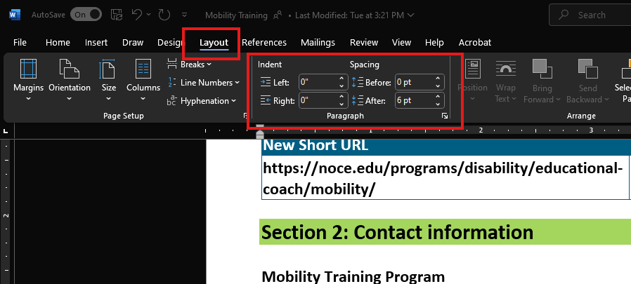
To make reading easier, you can change the space between paragraphs. If you want to change the spacing for the whole document, update the Style. To change it for just one section or paragraph, follow these steps:
-
Highlight the text you want to change.
-
Click on the Layout tab.
-
Change the numbers for Before and After spacing.
Don’t add extra space by pressing the Enter key to make a blank line. Some tools, like screen readers, might read these blank lines, making users think they are at the end of the document. This narration can also be annoying when the user is trying to read and navigate the document.
-
-
Alternative Text for Images
If you have an image in your Word document, then it should always have alternative text that describes it. Check out WebAim’s resource and information on alternative text.
To change the alt text for an image, right-click on it and choose View Alt Text. Type in a good description in the box that shows up in the Alt Text sidebar. If the image is just for decoration, leave the box empty and check Mark as decorative.
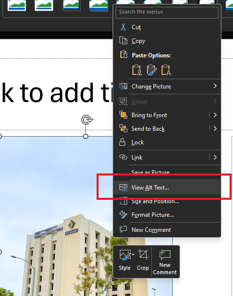
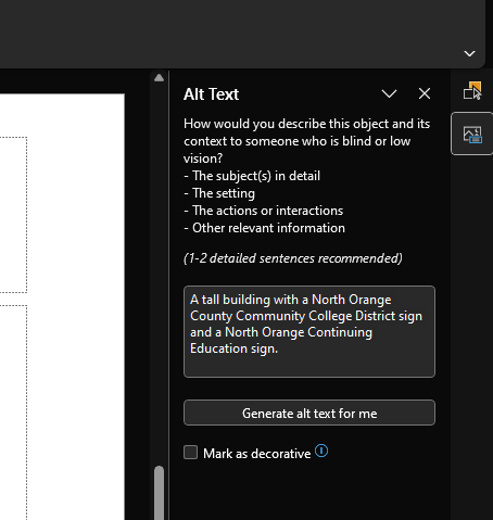
Don’t click the Generate alt text for me button. The descriptions it makes aren’t very good, and an image description is often different from the alternative text.
-
Tables
In HTML, you can label row and column headers in a table to help people who use screen readers. Word also lets you choose one row for column headers and one column for row headers. Here’s how to set up these headers in your table:
-
Click inside the table. You’ll see the Table Tools options, and the Table Design tab will be open.
-
If the top row has headers for each column (which is usually the case), make sure the Header Row box is checked.
-
If the first column has headers for each row, ensure the First Column box is checked.
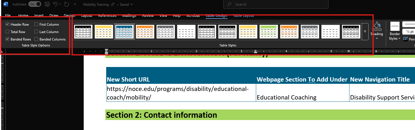
In the Table Styles section, pick a style that makes the table headers stand out. Make sure the style has a strong contrast so it’s easier to read.
Most screen readers might not notice table headers in Word, but it’s still a good idea to do this. Being able to see the headers is important, and Microsoft Office is getting better at supporting table accessibility. Also, when you save your document as a PDF using the newest versions of Word, these headers will be recognized.
-
-
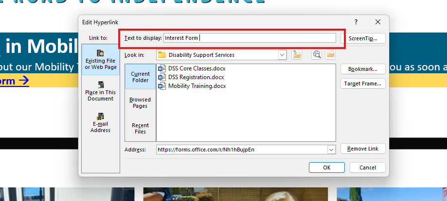
Links
Word makes a link when you paste a full URL onto a slide and then press Enter or Space. But just seeing the URL might not help people using screen readers or others understand it, so it’s important to make sure the link text explains what the link is about.
To change the link text, right-click the link and select Link. A dialog box will appear. Click in the Text to Display field at the top of the dialog and enter descriptive link text.
To make sure everyone can easily use your links, follow these simple rules:
-
Use clear link text that makes sense on its own, without needing extra information.
-
Keep the text in the link short and simple.
-
Choose underlined text in a color that is easy to see against the rest of the page.
If your Word document will be printed only, you should add the website address (URL) and a short description in the link. For example, you could write: “NOCE Admissions & Records FAQs (noce.edu/faq).”
-
-
Lists & Columns
The Importance of Proper Document Structure
Lists and columns are important for organizing a document. Sometimes, people make “lists” and “columns” by pressing the Tab key to move content to the right. This might look organized for people who can see, but it doesn’t help those using assistive technology.
You can make columns in Word, but using the right tools is important. You can go to the Columns menu on the Layout tab.
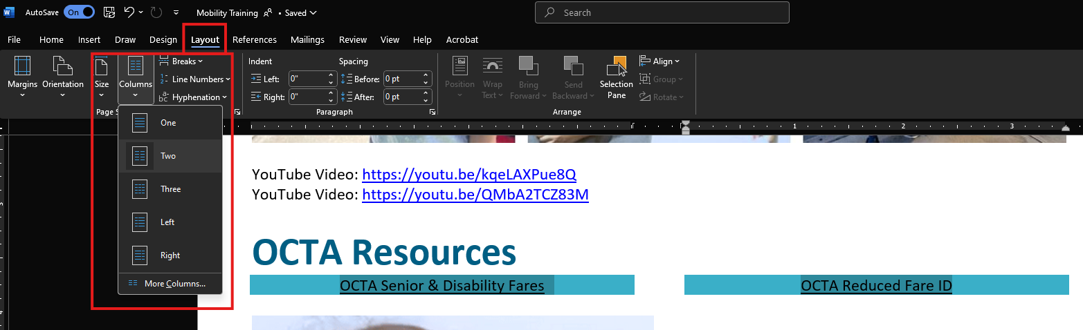
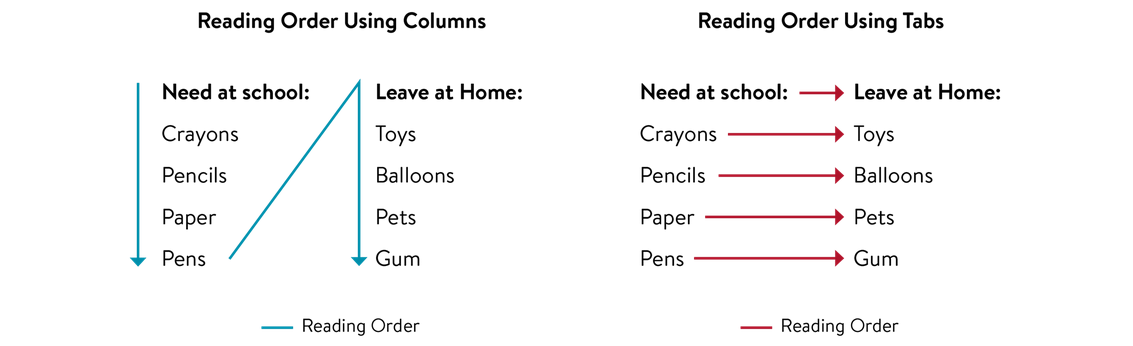
Why Reading Order Matters
Knowing how things are read is important when you set up your document. Screen readers read columns from top to bottom and left to right. But with tabs and tables, they read left to right first, then top to bottom.
In this example, columns are needed to organize lists of information well. The blue arrows show how the list is read when using columns, while the red arrows show how it’s read when using tabs.
The Importance of List Formatting in Microsoft Word
Using list formatting helps assistive technology recognize items in a list as a whole group. Microsoft Word offers different styles for creating lists.
Types of Lists in Word
There are two main types of lists you can make in Word: bulleted lists and numbered lists.
Bulleted Lists
These are great for showing a group of items that don’t need to be in a specific order:
-
Ketchup
-
Mustard
-
Pickles
-
Onions
Numbered Lists
These are used when the order or number of items is important:
-
Turn the grill on to “high” heat.
-
Cook the burgers on “medium” heat.
-
Flip the burgers when you see juices on top.
-
Take the burgers off when they reach an internal temperature of 160°F.
-
-
Accessibility Checker Tool
Word includes a tool that will identify many common accessibility issues.
To run the accessibility checker, select the Review tab and Check Accessibility.
You’ll see the Accessibility menu in the sidebar on the right.
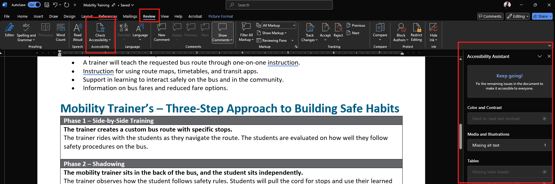
The checker’s inspection results organize accessibility issues into three main groups:
-
Errors: Content that makes it very hard or impossible for people with disabilities to use.
-
Example: an image without alt text.
-
-
Warnings: Content that usually makes the document hard for people with disabilities to use, but not always.
-
Example: a link with text that doesn’t clearly explain its purpose.
-
-
Tips: Content that is accessible to people with disabilities but could be better organized or presented.
-
Example: jumping from a first-level heading straight to a third-level heading.
-
When you click on an item in the results, it will highlight the section in the document and show the Additional Information section:
-
Why Fix:
-
Tells why the issue affects accessibility.
-
-
How to Fix:
-
Gives ideas on how to solve the issue.
-
-
-
Convert PowerPoint to PDF
Many Word documents are turned into PDF files because PDFs are usually better for sharing online. Almost everyone can open a PDF, even if they don’t have Word on their devices. If made correctly, all the accessibility edits to your Word document will still be in the PDF file.